|
 11-22-2008, 04:58 AM
|
#1 |
|
Administrator

Join Date: Sep 2008
Location: Phoenix
Posts: 1,209
|
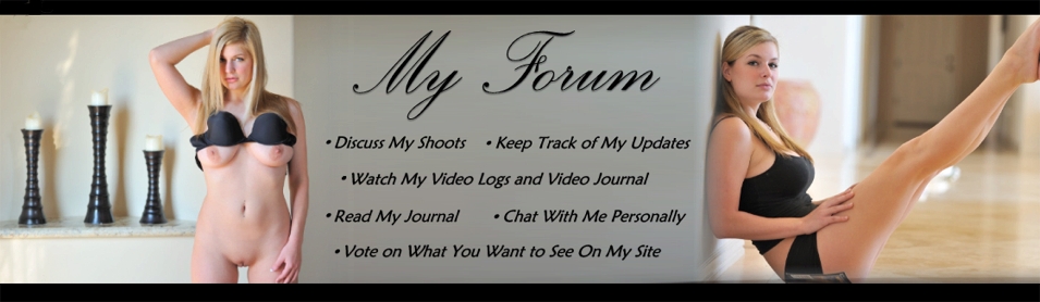
This is the current one:
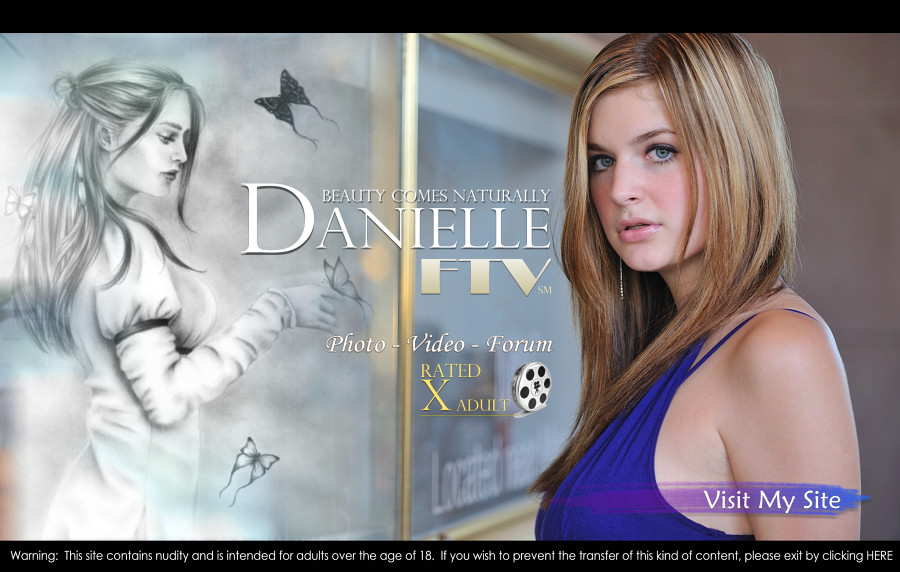 I've been working on a new one:  Yay or nay? I like it more because of the 'boobs' and it seems more inviting.
__________________
http://www.ftvgirls.com |

|

|
|
11-22-2008, 05:13 AM
|
#2 |
|
Danielle's Biggest Fan

Join Date: Oct 2008
Location: Near Orlando, Fl
Posts: 468
|
um... tough call. but i would have to agree with your take on the second one being "more inviting" i know that if i went on image alone, and i knew nothing about the girl on the website, the second one would make me more likely to investigate further. just my opinion.
|
|
|
|
|
11-22-2008, 05:14 AM
|
#3 | |
|
Moderator

Join Date: Oct 2008
Location: Germany
Posts: 2,015
|
Quote:
(Danielle will be back tomorrow, YEAH!)  For me, it's her eyes, that captivate me in the new pic. Her eyes and that almost smile. Verry alluring. Another example of your outstanding work, Rob. Thank you! |
|
|
|
|
|
11-22-2008, 05:16 AM
|
#4 |
|
Danielle's Biggest Fan
Join Date: Oct 2008
Location: Near Orlando, Fl
Posts: 468
|
good call. i have to agree with the look, eyes and semi smile makes it alluring.
|
|
|
|
|
11-22-2008, 05:16 AM
|
#5 |
|
Administrator
Join Date: Sep 2008
Location: Phoenix
Posts: 1,209
|
And this one for the welcome page:
 Replaced with this one: 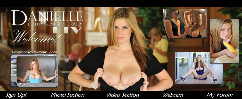 Notice that there will be a sign up button and a webcam button added to the menu. Opinions?
__________________
http://www.ftvgirls.com |
|
|
|
|
11-22-2008, 05:30 AM
|
#6 |
|
Danielle's Biggest Fan
Join Date: Oct 2008
Location: Near Orlando, Fl
Posts: 468
|
oooohhhh.... exciting news.... to bad it probably still months away... although, i could not think of a better birthday present than to have it running by December 16. no pressure.
|
|
|
|
|
11-22-2008, 05:46 AM
|
#7 | |
|
Moderator
Join Date: Oct 2008
Location: Germany
Posts: 2,015
|
Quote:
I like Danielle's smile in the old one better, but I love the blurred older lady in the background of the new one looking at us. (Assuming it is a lady.) That adds a sense of risk. On the old one I like that Danielle is obvioulsy topless, but not showing breasts, adding a kind of suspense. I'm not much of a help here, am I? |
|
|
|
|
|
11-22-2008, 01:05 PM
|
#8 |
|
Danielle's Imaginary Boyfriend

Join Date: Oct 2008
Location: Baltimore, Maryland
Posts: 876
|
Rob,
The new index page looks good. Since you're trying to bring in people who might not know anything about Danielle, what better way than to show her best physical features; her sparkling eyes, soft lips and beautiful breasts. One thought, I know you hate to photoshop your photos, but adding a tiny bit more color to her eyes and lips might make them stand out better. The new welcome page is also great for the same reasons I mentioned above. My only comment is that while the photos do a great job of showing her serious and sexy side, they don't show her sweet and innocent side nearly as well. It's the combination of these that make her great! Maybe include a small photo of her laughing or something like that. |
|
|
|
|
11-22-2008, 05:11 PM
|
#9 |
|
Danielle's Biggest Fan

Join Date: Oct 2008
Location: London, UK
Posts: 393
  |
OK my 2 penneth for what it's worth. I prefer the newer main page, as you say looks more inviting.
However prefer the original Welcome page, certainly prefer the main photo, it just seems a better photo with more colour contrast and sharper too, and smile is to die for. Also not keen on centre photo of the three on the righthandside of the new one, it's not a very flattering shot of Danielle imho. I think the original "little" photos. Perhaps a fairly tight cropped version of photo 110 in the Lambo set showing off the reflection in the door. Whatever Rob it's gonna be good. All the best. Y A D
__________________
Just call me Y A D, it's shorter - and none of the YetAnotherDave's on Google is me !! |
|
|
|
|
11-22-2008, 08:08 PM
|
#10 |
|
Danielle's Imaginary Boyfriend

Join Date: Sep 2008
Location: 3rd rock from the sun
Posts: 818
|
I would go with the new revisions. While I certainly love Danielle charming smile and beautiful eyes from a marketing point of veiw I believe her boobs will catch the surfers and draw them in. Also since a lot solo girl sites now have webcams I would change the order to Sign Up, Webcam, Video Section, Photo Section, My Forum with Video Section being centered underneath her boobs in the main picture.
__________________
But in your dreams whatever they may be Dream a little dream of me |
|
|
|
|
11-22-2008, 08:33 PM
|
#11 | |
|
Danielle's Future Ex-Husband

Join Date: Sep 2008
Location: out yonder way!
Posts: 1,093
|
Quote:
__________________
IF YOU SEE ME RUNNING YOU BETTER BE RIGHT BEHIND ME!!!! |
|
|
|
|
|
11-23-2008, 12:27 AM
|
#12 |
|
Danielle's Biggest Fan
Join Date: Oct 2008
Location: New Jersey
Posts: 283
|
on the first set i like the second better. the first she looks almost frightened. the second has a sensuous look.
as for the welcome page. i love the pic in the first. it just captures me. but the second one shows daring and risk along with her beauty. so it is a toss up here. oh and i disagree about adding color to her eyes or lips.... natural for her is a very appealing look. |
|
|
|
|
11-23-2008, 04:33 AM
|
#13 |
|
Danielle Junkie

Join Date: Oct 2008
Location: Canada
Posts: 27
|
Either one is fine. Not really a big deal to me but a little change once in a while would be nice. At least you kept that beautiful drawing of Danielle.
|
|
|
|
|
11-23-2008, 09:20 AM
|
#14 |
|
Danielle Junkie

Join Date: Nov 2008
Location: Sicily - Italy
Posts: 45
|
i think that the second is much better than the first! i like in the second the sensual expression of Danielle..
|
|
|
|
|
11-25-2008, 02:25 AM
|
#15 | |
|
Administrator

Join Date: Sep 2008
Location: Phoenix, Arizona
Posts: 3,321
|
Quote:
__________________
XOXO Danielle FTV |
|
|
|
|
|
11-28-2008, 10:37 PM
|
#16 |
|
Danielle's Imaginary Boyfriend

Join Date: Sep 2008
Posts: 512
|
I'm still catching up with my reading and this thread caught my eye. For what its worth, I like the new front page better--Ms D does look much better, the setting is sumptuous (I, too, like the li'l old lady looking on in the background--naughty naughty!), and I'm glad Rob intendeds to keep that amazingly gorgeous drawing he did of Ms D! As for the index page, I like that, too, but if I man, the head & shoulders image of Ms D from the first could easily be cropped to fit the bill for one of the smaller photos--it is really one of the best photos I've seen composition-wise--her inviting, semi-mischievous, always beguiling smile, the look in her eyes, plus the background of lovely green foliage coupled with her bare shoulders & the way the sun shines on her hair is just irresistible, no? Anyway, chances are Rob's already created something that will strike just the right tone for the site, but still I "had" to make a plea to keep that one image in particular.
|
|
|
|
|
11-29-2008, 11:19 AM
|
#17 |
|
Danielle Junkie

Join Date: Oct 2008
Location: sydney, AUS
Posts: 33
|
It is a good idea ROB i think the news sets of images to be replaced are as gorgeous and inviting as the current ones...... i think its really good work being put by you...... i think its up to danielle to decide...... but my opinion i think its good idea........... and i cant wait for the new section and the webcam..... cant wait for that........
|
|
|
|
|
11-29-2008, 11:24 AM
|
#18 |
|
Danielle Junkie
Join Date: Oct 2008
Location: sydney, AUS
Posts: 33
|
Please no adding colors....... dont modify her natural beauty........i pray
|
|
|
|
 |
|
|


 Linear Mode

